For some smartphone users, the goal is not digital minimalism or productivity. It’s simply making everyday phone use feel a little less automatic.
A lot of phone home screens used to look crowded on purpose.
Every app was visible. Social apps sat near the thumb. Shopping apps stayed one tap away. Games, streaming platforms, delivery services, airline apps, banking apps — all arranged like a personal control panel built for maximum speed.
Now a lot of people seem to be doing the opposite.
Their first screen has almost nothing on it.
Messages. Maps. Camera. Calendar. Maybe notes. Maybe payments. Sometimes weather. Sometimes a widget showing the next meeting or today’s tasks.
Everything else gets pushed away.
Social apps move into folders. Entertainment apps disappear onto secondary screens. Shopping apps stop sitting out in the open. Some people remove icons entirely and open apps only through search when they actually need them.
The result can feel strangely empty at first glance.
Not minimal in a polished lifestyle way. More practical than aesthetic.
For some people, the home screen now looks less like an app launcher and more like a quick status check before getting on with the day.
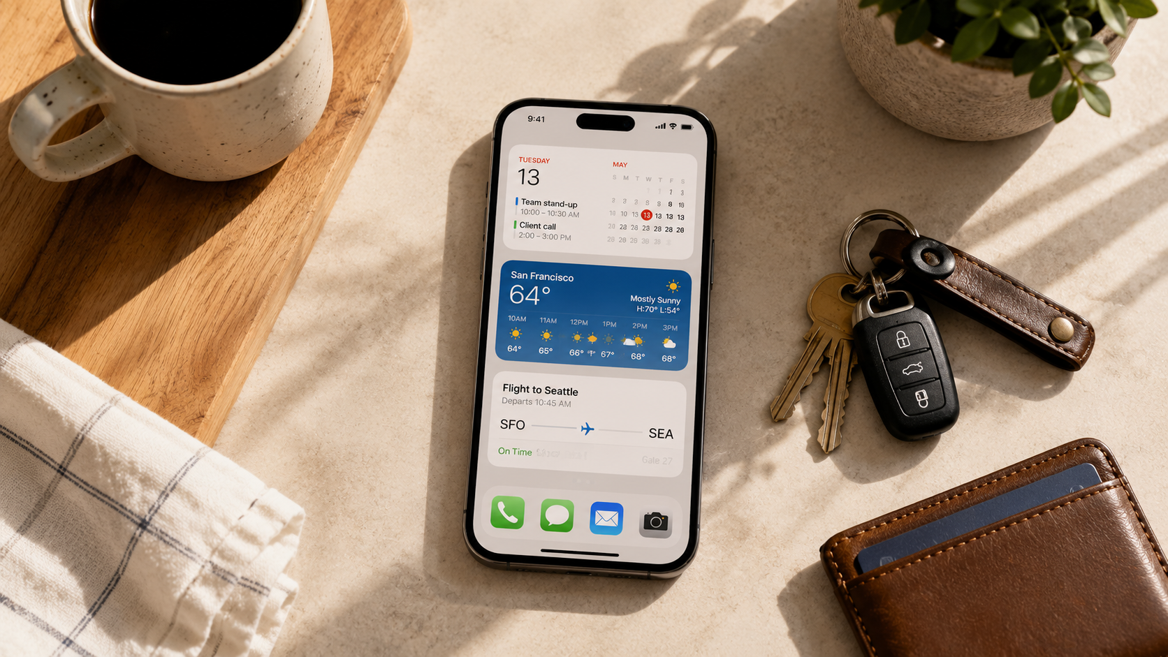
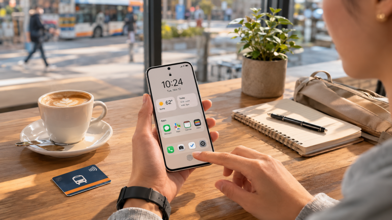
You can see it in the way some users replace dense app grids with widgets or passive information displays.
Instead of dozens of colorful icons competing for attention, the first screen sometimes just shows:
- weather
- calendar
- battery
- to-do lists
- travel times
- sleep data
The phone opens into information instead of a visual menu of everything installed.
Part of this behavior also seems connected to interruption fatigue.
People describe moving Instagram, TikTok, YouTube, Reddit, or shopping apps farther away not necessarily because they want to quit them completely, but because they got tired of opening them reflexively.
Someone unlocks their phone to check the time and suddenly they’re watching videos eight minutes later. Someone opens a delivery app out of boredom without even being hungry. Someone taps Instagram while waiting for an elevator before realizing they already checked it two minutes earlier.
The extra friction seems to matter for at least some users.
Some people keep distracting apps inside folders with intentionally boring names. Others rely heavily on app search so there’s a tiny pause before opening something out of habit.
The behavior feels especially recognizable during work hours.
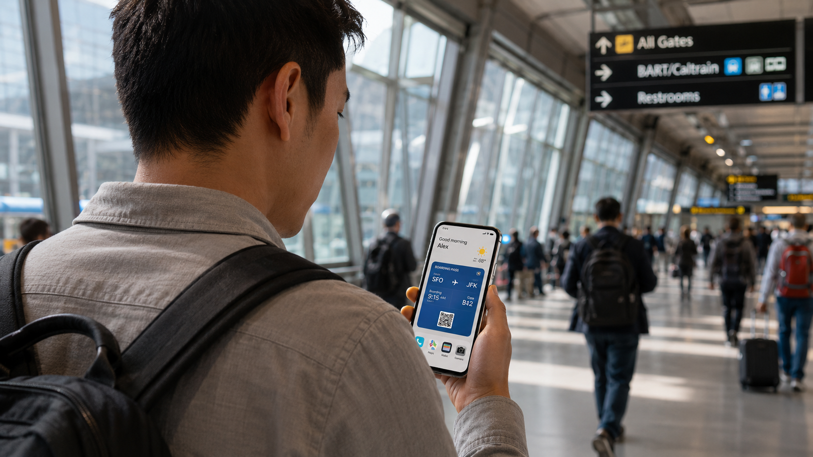
Someone unlocks their phone to check a calendar notification, scan a boarding pass, reply to a message, pay for coffee, or open a QR code. They do the task. Then the phone closes again.
Older home screen layouts often encouraged more visual wandering between apps. These newer layouts sometimes feel more comfortable treating the phone like a utility tied to specific tasks.
That doesn’t necessarily mean people are using phones less.
Many users still spend hours a day on them. The difference seems more connected to visibility than total usage. Entertainment is still there, but it no longer dominates the first thing some people see every time the screen turns on.
There are also clear differences between users.
Some people still organize phones around speed and abundance. Their home screens remain dense, colorful, and highly active. Everything is reachable instantly. Notifications stay visible. Widgets compete with app stacks rather than replacing them.
None of those approaches necessarily signal healthier or worse habits on their own. They often reflect different routines, work styles, attention patterns, or preferences around convenience and visibility.
But among people whose phones constantly handle work, communication, scheduling, payments, navigation, tickets, authentication, and travel logistics, quieter first screens feel increasingly recognizable.
Part of what makes the shift feel familiar is how small the changes are.
Very few people dramatically abandon apps. Instead they rearrange access.
An app that once lived on the dock moves three screens away. Notifications get removed but not deleted. Search replaces tapping. Widgets replace scrolling. The device still does the same things, but the opening experience becomes calmer.
There’s also something revealing about which apps survive the first-screen purge.
Usually the remaining apps are tied to immediate real-world tasks:
- directions
- communication
- payments
- time
- transportation
- authentication
- camera access
The apps that disappear from the first screen are often the ones built around open-ended scrolling.
The modern phone still contains everything. But more people seem to want their phones to stop presenting everything all at once.
Even the visual texture changes.
Packed folders. Bright icon collections. Constant badges. Motion everywhere. A busy screen once signaled personalization or digital fluency.
Now many home screens look intentionally incomplete.
Large empty spaces. One or two widgets. A few practical apps. Maybe a muted wallpaper. Sometimes only a single page before the app library takes over.
The interesting part is how ordinary the behavior feels once you notice it.
You see it when someone unlocks their phone to pull up a parking ticket or boarding pass and there’s almost nothing on the screen. You see it when people can’t remember where an app lives anymore because they stopped visually browsing for it. You see it when someone says they hid TikTok not to quit, but to stop opening it repeatedly without thinking.
Phones are still entertainment devices for millions of people, and highly visible app-packed home screens are not disappearing.
But there does seem to be a recognizable group of users treating the first screen less like a destination and more like a controlled entry point.